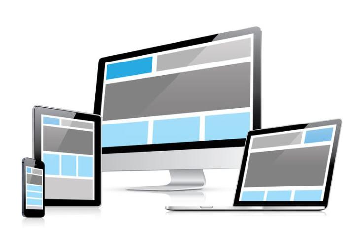
Media queries are a feature of CSS that enables webpage content to adapt to different screen sizes and resolutions. Media queries may be inserted within a webpage's HTML or included in a separate.CSS file referenced by the webpage.

Visual Breakpoints
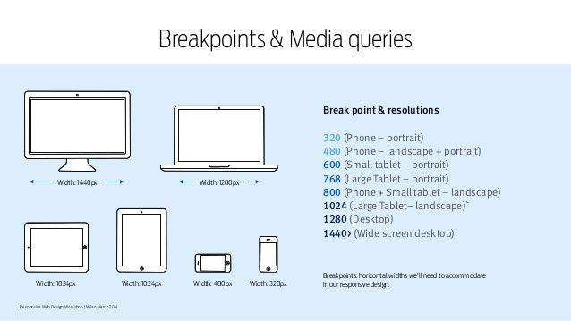
Bootstrap categories different devices in 4 categories on the basis of device widths such as extra small devices, small devices, medium devices, and large devices. Bootstrap provides different notation based on these categories and defines CSS classes on the basis of that.

All the devices having width <768px fall in the category of extra small devices such as mobile devices. Bootstrap provides "xs" to represent these devices.
All the devices having width >=768px and <992px are fall in the category of small devices such as tablet devices. Bootstrap provide "sm" to represent these devices.
All the devices having width >=992px and <1200px are fall in the category of medium devices such as laptop devices. Bootstrap provides "md" to represent these devices.
All the devices having width >=1200px are fall in the category of large devices such as large desktop devices. Bootstrap provides "lg" symbol to represent these devices.
Bootstrap provides 12 column grid layout structure to make the layout responsive. Bootstrap divides the complete device-width into 12 columns. A number specified with the class represents the element having that class will take the specified number of column space of total of 12 columns.
Example: If we define a class '.col-sm-6' on the <div> element then this means that this <div> element will take the 6 column space of total 12 columns on small, medium and large devices and complete 12 columns on extra small devices.
Using these above bootstrap syntax we can change the responsive of the web page. Responsive layouts automatically adjust and adapts to any device screen size, whether it is a desktop, a laptop, a tablet, or a mobile phone.
Responsive Utilities - Responsive utilities for hiding and showing elements based on the browser size. This will also help us in defining our grid system.
Classes Devices
.visible-xs - Extra small (less than 768px) visible
.visible-sm - Small (up to 768 px) visible
.visible-md - Medium (768 px to 991 px) visible
.visible-lg - Larger (992 px and above) visible
.hidden-xs - Extra small (less than 768px) hidden
.hidden-sm - Small (up to 768 px) hidden
.hidden-md - Medium (768 px to 991 px) hidden
.hidden-lg - Larger (992 px and above) hidden
Classes to show stuff
.visible-xs, visible-sm, visible-md, visible-lg ...etc
Classes to hide stuff
.hidden-xs, .hidden-sm, .hidden-md, .hidden-lg ... etc
For Example, How the class .visible-xs works
.visible-xs - if you wanted to only show a certain div in small screens you would do it this way:
This would work fine and your div will indeed be hidden in all screens except small ones. Looking at the Bootstrap code you can see how this is accomplished:
All the above "Responsive Utilities" syntax works based on screen size.
BOOTSTRAP MEDIA QUERY BREAKPOINTS
Refers to everything less than or equal to the amount given.
Below is an example of the media query using Max-Width
/* Large Devices, Wide Screens */
@media only screen and (max-width : 1200px) { /* Custom Styles */}
Refers to everything greater than or equal to the amount given.
Below is an example of the media query using Min-Width
/* Custom, iPhone Retina */
@media only screen and (min-width : 320px) { /* Custom Styles */}
Below is an examples of the media query using (Min-Width and Max-Width)
@media only screen and (min-width:768px) and (max-width:1029px) { /* Custom Styles */}12 Column Grid Layout structure